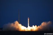
I absolutely agree!I like the style of the first logo.
Each mission requires a different logo. I hope to see that designer's work again in the future.Seems like a nice departure from the usual style, wonder why not use it for the next two missions
I did a little searching and the designer seems to be a young man who graduated from college three years ago. (Not sure) That might explain why the logo is so unique.
BTW, The solar panels in the logo cleverly form the Chinese character “廿”(“twenty”). I think this could also explain why it's special.
Last edited:


