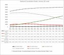
I noticed something a bit curious if anyone can answer...
So the Hopkins site :
Points to CSV data on github:
After exporting it into excel, and taking out all the locations except for Mainland China MINUS Hubei, and graphing a chart of the total confirmed cases per day, it seems too smooth?
So the data for "all others locations in China outside of Hubei" is just an estimation or projection or what? It seems unlikely that in real life it would be such a perfectly smooth curve (with exception to that one part I boxed in red)"


