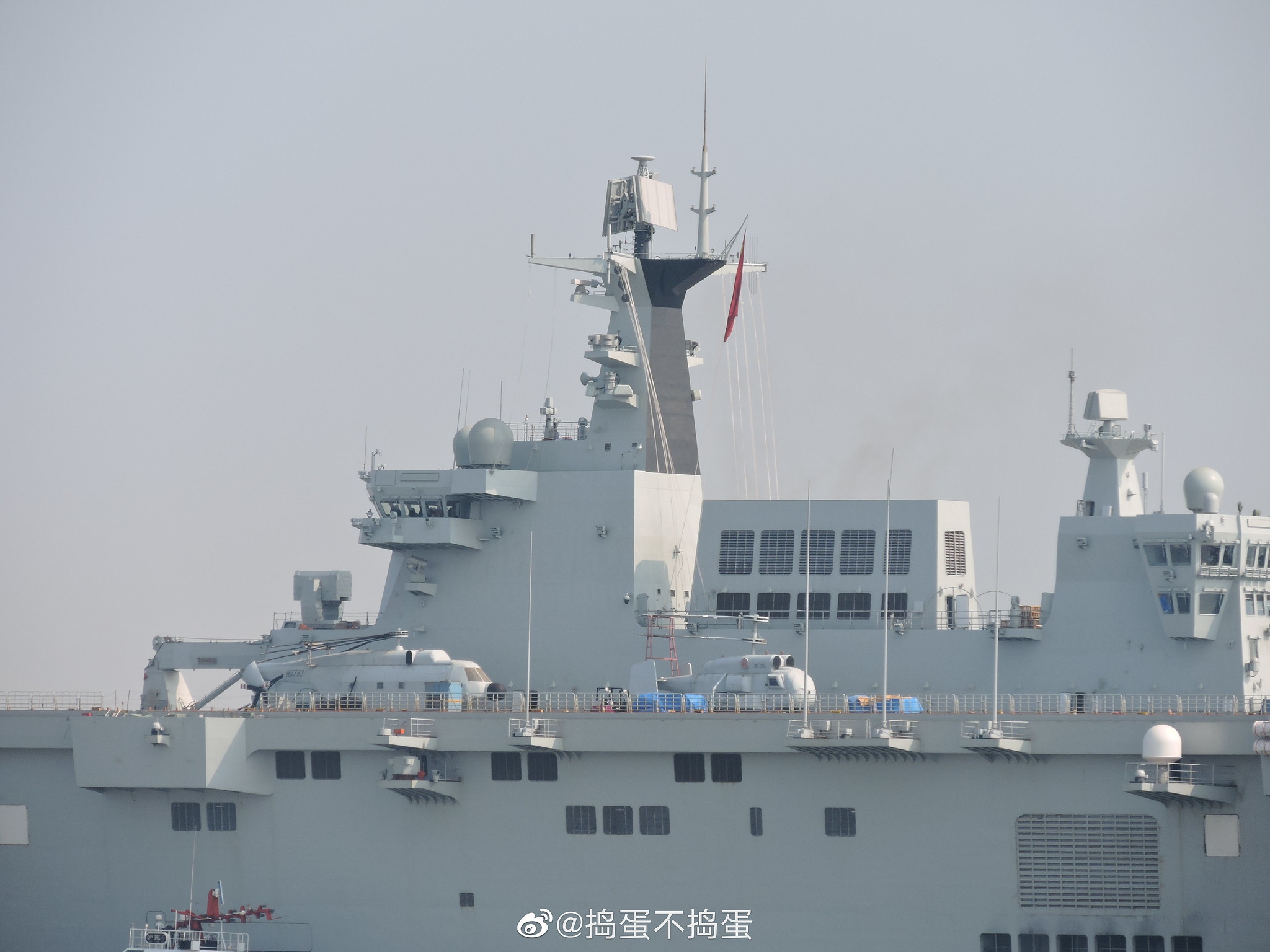
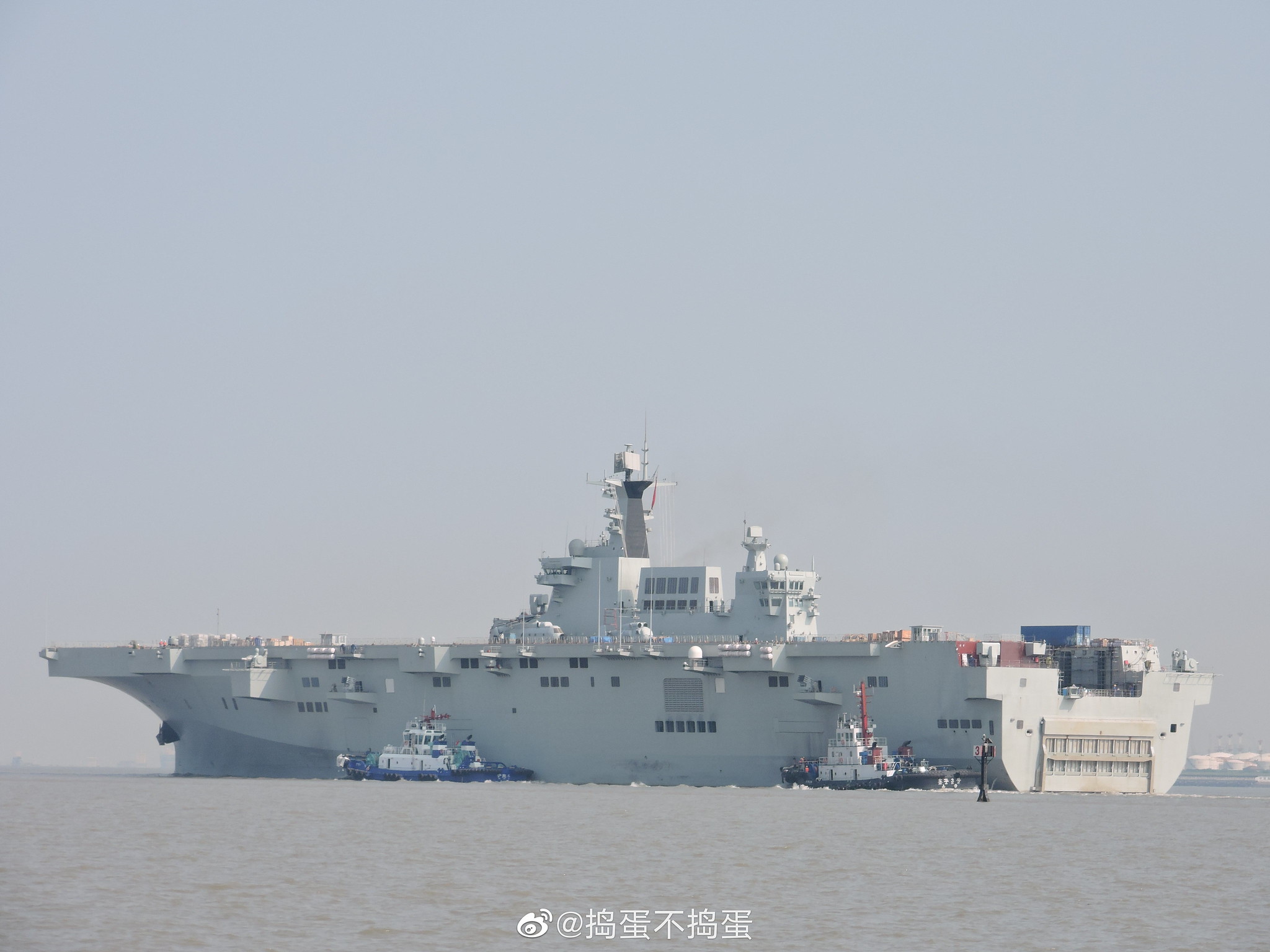
As the founding father of modern China once said, it doesn't matter if a cat is black or white, as long as it catches the mice, well then it is a good cat. I'll leave it at that.To be honest, I feel like the type 075 looks kinda ugly. The superstructure seems too sharp with not enough curves and all the different platforms jutting out the side look like pimples
You are using an out of date browser. It may not display this or other websites correctly.
You should upgrade or use an alternative browser.
You should upgrade or use an alternative browser.
075 LHD thread
- Thread starter nosh
- Start date
What are the modules that jut out the sides? Radars? Dock mountings?
In addition to concealing soot buildup, black paint improves the cooling of the surface, due to being a better radiator.They have painted part of the forward mast black (see circled part), likely done for cosmetic reasons to make soot buildup less obvious.
To be honest, I feel like the type 075 looks kinda ugly. The superstructure seems too sharp with not enough curves and all the different platforms jutting out the side look like pimples
TBH, I like it. It's a different aesthetic and stands out compared to the Western designs.
Again some news from the Hudong-Zhonghua Shipyard, where the Type 075 LHDs are built and fitted out: Allegedly the lead vessel (no. 01) was transferred to another shipyard or facility nearby.
But could it also be simply its second trail?
(Images via @捣蛋不捣蛋 and @_老年_ from Weibo)
View attachment 64112View attachment 64113View attachment 64114View attachment 64116View attachment 64117View attachment 64118
Is all the smoke normal?
Hendrik_2000
Lieutenant General
Yes It is normal smoke come from incomplete combustion specially at start up when the engine is relatively cool But as it get hotter it will improve the combustion and the smoke will be gone !
I like the superstructure, but the front is too rectangular for me.To be honest, I feel like the type 075 looks kinda ugly. The superstructure seems too sharp with not enough curves and all the different platforms jutting out the side look like pimples
Hi UrsusMan,I like the superstructure, but the front is too rectangular for me.
Same here, it look so ungainly with the design of the superstructure, if they took the front design of Japan IZUMO class or SK DOKDO class it will be aesthetically pleasing, that's my view


