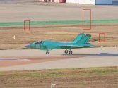
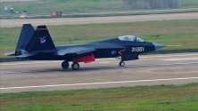
About the image from Twitter: I put it into Photoshop and played with it a bit. Here's what I can tell (just take note that I'm a very practical user of PS, not a professional graphic specialist, but I know how computer graphics works):
The image has low resolution because it most likely was taken from very far away. It's 800x600 for Twitter but it is not the kind of image that you get by reducing a 4096x3072 image in size. To me it looks like a large (5MP or more) image taken at a large distance. The aircraft could have been moving but it wasn't moving very fast because it is only slightly more distorted than the buildings in the background.
The image also has been saved with a very
high compression rate which produces the distortions. It has 54,5kB but when I saved it with the "natural" compression rate in PS it showed "high" and resulted in 84.8kB. That's a lot for a few added single-color lines. So the compression algorithm had to be set to minimize size.
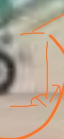
Take a look at this.

The thin elements have similar distortions around them as the wheels - that's because some compression algorithms make a mess of pixels when they have to compress an image with thin high-contrast elements. Raster images work by assigning numerical values to every pixel in the image and compression works by averaging the values with specific weighed algorithms. It works very well for fuzzy blotches of various shades of green like compressing trees but not for thin elements like a sign post or the supports of the wheel. This is how you get the "shadow" that looks like a blur. Those distortions are most likely an
artifact i.e. an error in the image resulting from an imperfect mathematical formula.
However I also outlined what was a fairly clear rectangular blur region on the aircraft's nose. You can recognize it by opening the (original) image in any raster editor and see the
sharp straight lines of separation between two different fields of pixels. They have different colour averages. That's a blur effect hiding something. I can't tell how legible it was because the blur is essentially almost an uniform colour area.
Hope this is helpful.


