You are using an out of date browser. It may not display this or other websites correctly.
You should upgrade or use an alternative browser.
You should upgrade or use an alternative browser.
Infantry Combat Equipment (non-firearm): Vests, Body Armor, NVGs, etc.
- Thread starter by78
- Start date
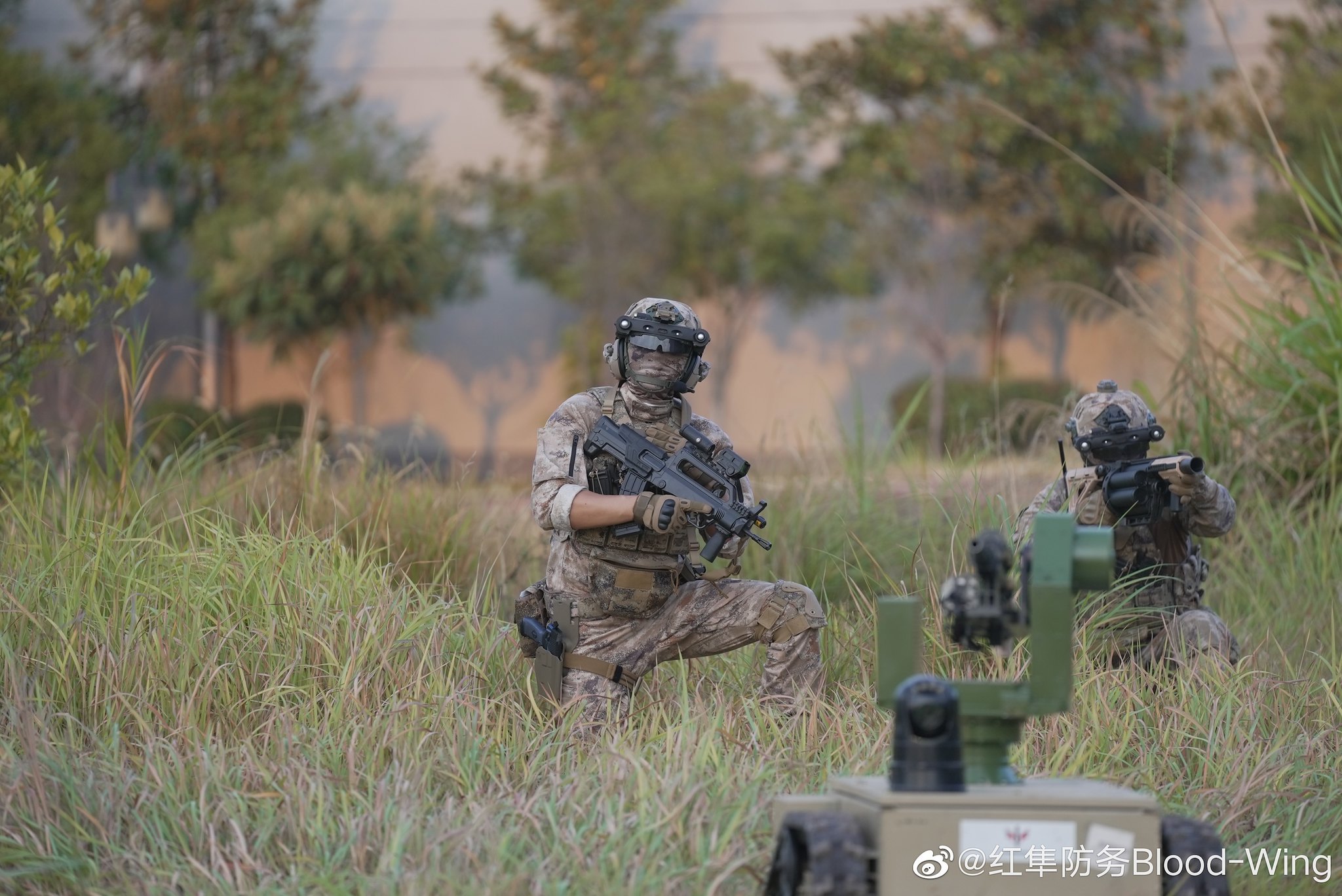
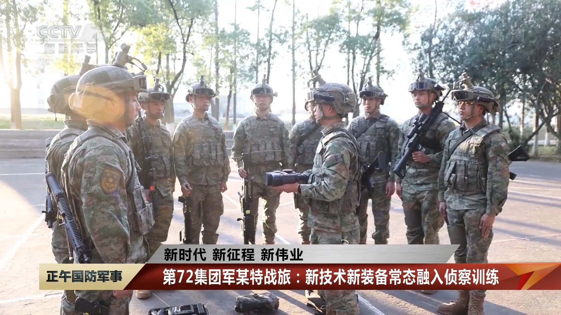
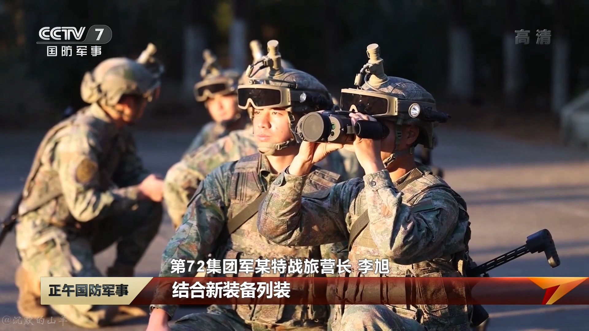
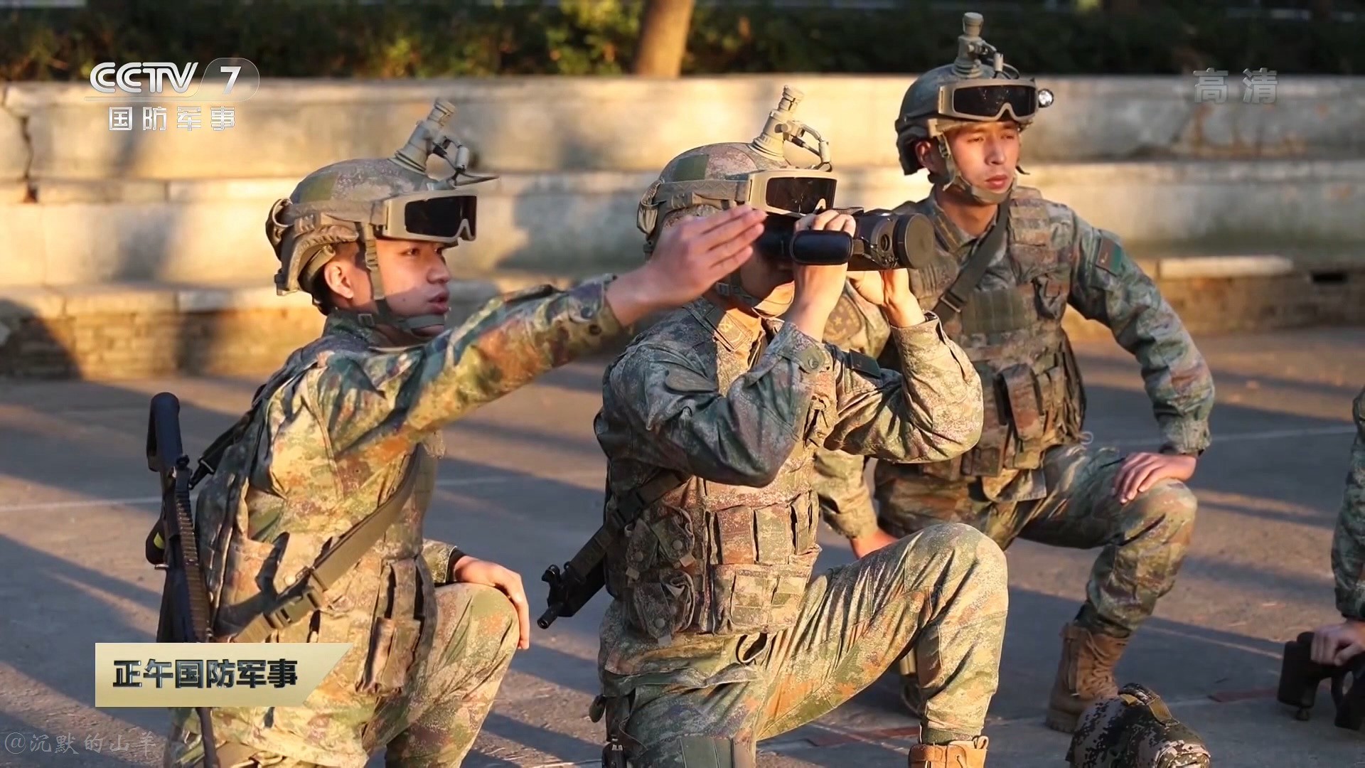
Please ask your question in the relevant thread in the future. That thread your question was in is only about the QBZ 191 series. As for your question, yes:Are the PAP transitioning to the same boltless new helmets like the PLA?
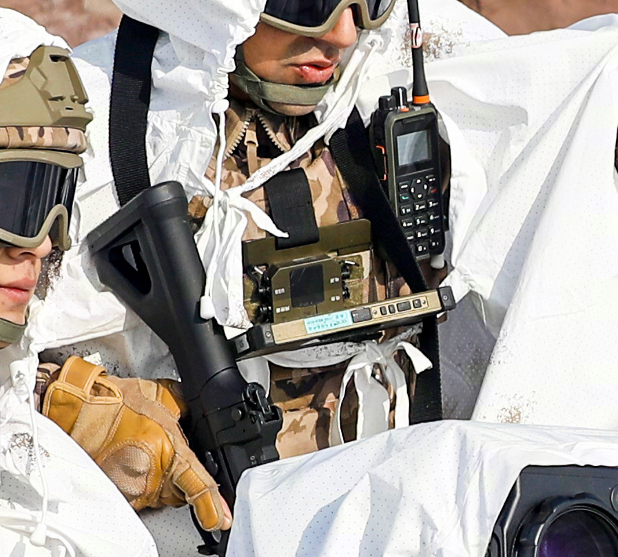
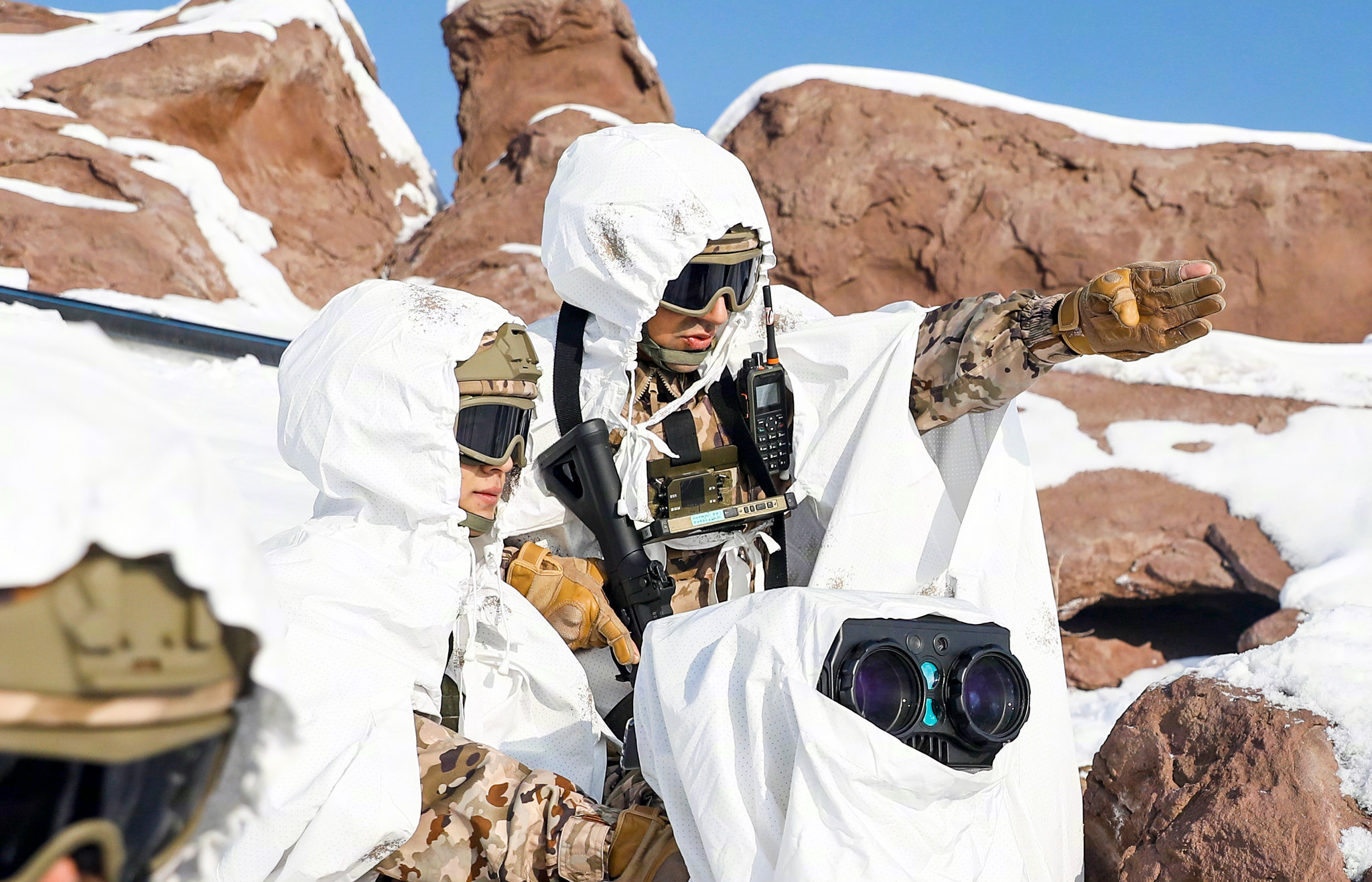
A chest-mounted smart terminal on a soldier of the People's Armed Police.
by78
General
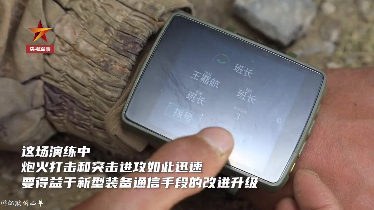
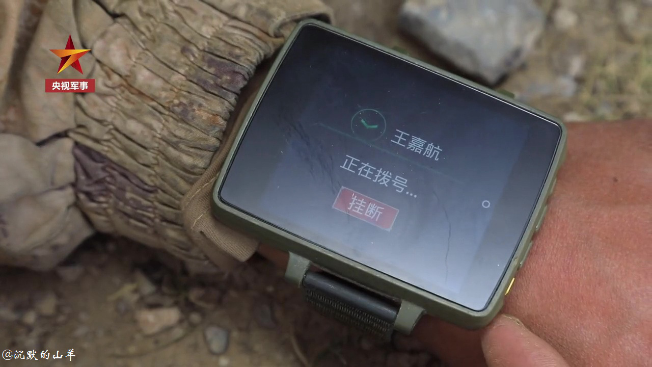
I think it is the first time I saw Chinese troops with that wrist computer.
Here's an earlier post that gives a good look at the wrist terminal:
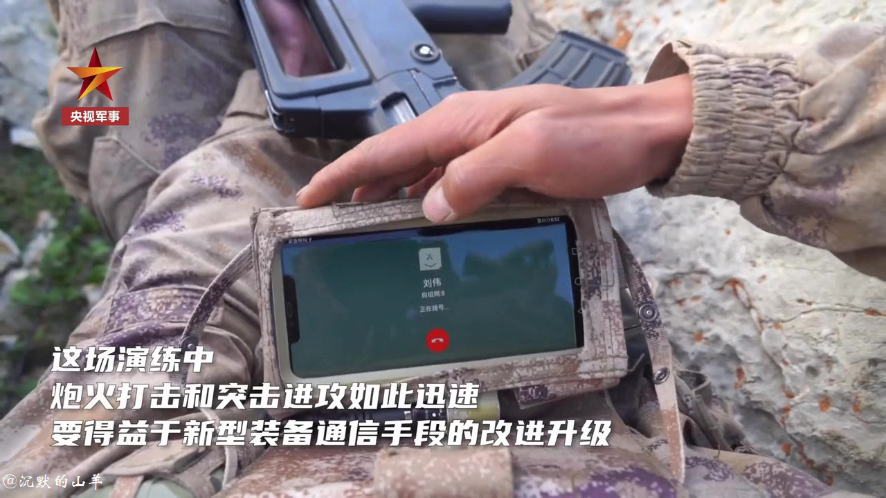
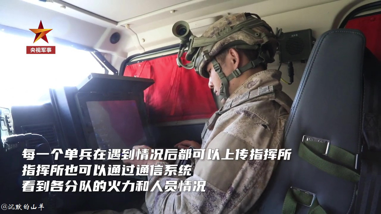
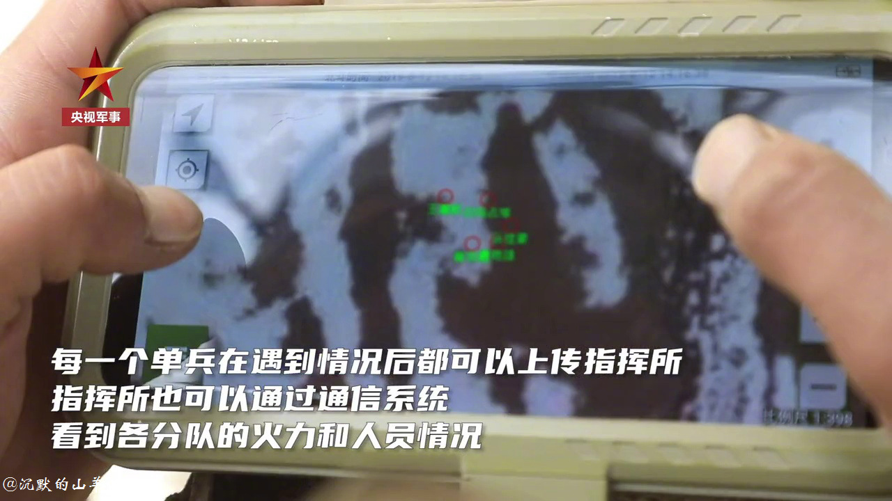
The smart soldier system. Note the wrist-mounted device, which I haven't seen before. The captioning doesn't say much: individual soldiers can send situation reports to the command center, which can monitor soldiers' individual status. The last image shows a chest mounted tablet displaying a team of five soldiers on a satellite terrain map.
commanders are gonna get information overload easilyHere's an earlier post that gives a good look at the wrist terminal:
That I think is the biggest problem with such networked C3I systems. Hopefully like in latest fighter aircraft some AI algo is in place to filter the information so only what is most relevant is displayed.commanders are gonna get information overload easily
I think the UI design of the hand terminal can reduce the info clutter. The initial screen can have a list of simple choices such as “Under fire”, “I’m wounded”, “My teammate is wounded”, etc. There can be an option go go into a secondary menu with a list of choices depends on previous selection. For example, if the soldier selected “Under fire” in the first screen, the choices in the second screen can be “infantry”, “armour”, “artillery”. The third screen options can be the direction and maybe the coordinate of the enemy. At each screen the soldier can send off the message without going to the next screen.
The platoon terminal or higher can display the location of each soldier and their colour coded status. The commander can tap on each soldier to see the message he/she sent. The terminal can also display the enemy locations or their general directions reported by the soldiers. UAV with simple object recognition AI can be sent to verify and locate the enemies and mark them (colour coded types) on the map. The commander can tap on each enemy and the AI will list the firing options available (mortar, artillery, suicide UAV, loitering munitions, etc) in the area and the estimated arrival time. Once the commander select the firing solution, the coordinate will be send to the relevant teams and those teams will act on the request.
AI may be utilized to provide firing solution to all identified enemy targets in a given area and depends on the enemy types and firing solutions available in the area, recommend the best firing solution for each target so the best distribution of available fire can be utilized.
In the battlefields of the future, every soldier is simply an information gathering node. They aren’t/shouldn’t be expected to do the killing at all.
MwRYum
Major
Early generation flak armour doesn't stop bullets, they stop shrapnel (mostly) but they were still heavy and too often need steel plating to make it effective, which makes it even heavier. What start to turn things around is proliferation of Kevlar and "soft" body armour. Ceramic ballistic plates further improves it.Wasn't that the case with the US as well when flack armor was first introduced? I remember reading somewhere years ago that when flack armor was first used, many soldiers would ditch it and still go without any armor at all because it limited their mobility a lot. One example was how much harder it was to jump through windows or small entrances.
With China start to make Kevlar analog and ceramic plates affordable, thus you see the US-led Western bloc start to "regress" to high-caliber small arms.

